.png)
WELCOME TO MY PORTFOLIO!
JOE SHEISTY SAUCE
.png)
After reflecting on another Cincinnati Bengals' season coming to a end being eliminated from playoff contention for a third straight season, I revisited an old project over the weekend from my time as a design student at Sinclair, dedicated to Joe Burrow, the starting quarterback. In this project, I decided to refocus on using the Bengals' brand colors instead of my own for a fictional sauce brand. This change was aimed at giving the product a more wholesome feel, reminiscent of something crafted by a local Cincinnati grocery store. I named the sauce “Joe Sheisty,” inspired by the nicknames that emerged during the team's Super Bowl run in 2021. I believe this name adds a unique touch to a flavorful sauce that captures the spirit of the city and its beloved quarterback.
DESIGN
PROCESS

VALIANT SPORTS DRINK

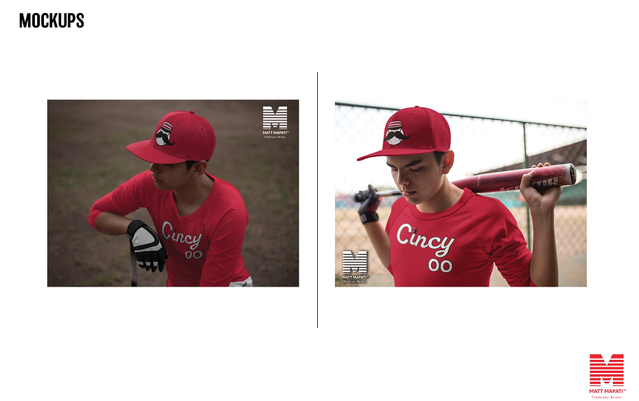
MAPATI BASEBALL CARDS
The second project of my portfolio, the concept for this is to create a sports drink that targets the natural freedom of what an athlete is supposed to be. To let their spirits and competitive fire be released into the playing field at a higher level by the power of drinking Valiant.
COLORS

The third project involves me developing baseball cards from scratch. Since I made this around the beginning of Spring and wanted to do a tribute to my favorite sport, I illustrated and printed my brand in Adobe Illustrator. This will be great for the community that truly loves America’s pastime.
THRILLER 40TH ANNIVERSARY ALBUM

This project is a tribute to the best-selling album of all time and a celebration of its forty years of release. I wanted to make the cover far from its primary one, I did it by searching Michael Jackson’s pictures during his time creating the album from 1981 to 1982 while keeping the classic cursive type font of the album title.
COLORS

MR.FIESTA SPICE CONTAINER

The concept was inspired by Mexican culture, I admired the art, especially the colors that bring a lively, vibrant, and spark emotion when it comes to celebrating a birthday, anniversary, or milestone. And since I’ve experienced much Latino culture, especially through cartoons, food, and sports, I wanted to make my spice package design as a tribute. First I search for color palettes to which representatives of an actual fiesta will look like, so a person can look at it and say that’s a Mexican spice.
COLORS

UPLIFT FITNESS
.png)
The inspiration for Uplift Fitness came from a location in a city that’ll bring the integrity of hard work. We look at the city of Philadelphia as the perfect spot located east side of the Pennsylvania border towards New York, fellow Philadelphians, and others around the world will be intrigued by our brand message. In Uplift, we want to change the fitness community into something special to where we can all be part of through communication, accountability, and most importantly fun based upon excellent training service, equipment, delicious healthy began burgers and tacos, and biotech sensor watches, and pants to track their everyday fitness.
BRANDING PROCESS
BRANDING PROCESS

Our mission is to build a new experience in the world of fitness by developing innovative technology, and engaging workouts by our first-class training staff as they would be behind your back through your fitness journey without charge to your membership. We want every single customer to come out of it feeling
great about themselves with their overall mental health and lifestyle, that they can do anything by putting their mind to it.
GALLERY


EXTERIOR

INTERIOR

COLORS

UTAH MOUNTAINEERS

Following my love for baseball I’m a huge fan of sports uniforms because it creates a cool brand identity of what the team is and where they came from. I created a fictional baseball team based in Salt Lake City, Utah since baseball is the second largest sports market in the city with basketball leading number one due to the popularity of the National Basketball Association Team the Utah Jazz.


DESIGN PROCESS
COLORS


ROAD
ALTERNATE 1

ALTERNATE 2


HOME
CINCINNATI REDS REBRAND 2026-PRESENT
This is a full rebrand for one of the oldest franchises in Major League Baseball the Cincinnati Reds, they're my favorite baseball team. I felt it was time for them to get new uniforms and I went for the classic big red machine days but with a modern style twist to it by using the faceoff twist font to achieve it. Meanwhile dropping the black shadows and simplifying the outer lines to be flat with a red clean finish.
![Reds Uniforms Rebrand 2026 [Recovered]-05.png](https://static.wixstatic.com/media/cc6888_9a1f2f8570c444e7b15abc4d967e3c1b~mv2.png/v1/fill/w_304,h_203,al_c,q_85,usm_0.66_1.00_0.01,enc_avif,quality_auto/Reds%20Uniforms%20Rebrand%202026%20%5BRecovered%5D-05.png)
![Reds Uniforms Rebrand 2026 [Recovered]-04.png](https://static.wixstatic.com/media/cc6888_5eb9fa75a92940f3aec1a20dbda738d9~mv2.png/v1/fill/w_331,h_221,al_c,q_85,usm_0.66_1.00_0.01,enc_avif,quality_auto/Reds%20Uniforms%20Rebrand%202026%20%5BRecovered%5D-04.png)
![Reds Uniforms Rebrand 2026 [Recovered]-06.png](https://static.wixstatic.com/media/cc6888_b18e0c1ccc014643a94d534974228444~mv2.png/v1/fill/w_321,h_221,al_c,q_85,usm_0.66_1.00_0.01,enc_avif,quality_auto/Reds%20Uniforms%20Rebrand%202026%20%5BRecovered%5D-06.png)
![Reds Uniforms Rebrand 2026 [Recovered]-01.png](https://static.wixstatic.com/media/cc6888_a66e3d7988794ce4a9a890361b860cfc~mv2.png/v1/fill/w_600,h_400,al_c,q_85,usm_0.66_1.00_0.01,enc_avif,quality_auto/Reds%20Uniforms%20Rebrand%202026%20%5BRecovered%5D-01.png)
![Reds Uniforms Rebrand 2026 [Recovered]-02.png](https://static.wixstatic.com/media/cc6888_e431121de00c483f9eaaea019cdc82bb~mv2.png/v1/fill/w_600,h_400,al_c,q_85,usm_0.66_1.00_0.01,enc_avif,quality_auto/Reds%20Uniforms%20Rebrand%202026%20%5BRecovered%5D-02.png)
![Reds Uniforms Rebrand 2026 [Recovered]-03.png](https://static.wixstatic.com/media/cc6888_031b554a69e74733b69f3b562c1d6b5a~mv2.png/v1/fill/w_600,h_400,al_c,q_85,usm_0.66_1.00_0.01,enc_avif,quality_auto/Reds%20Uniforms%20Rebrand%202026%20%5BRecovered%5D-03.png)
![Reds Uniforms Rebrand 2026 [Recovered]-07.png](https://static.wixstatic.com/media/cc6888_174e40f97f3d4eebb73405004ad36d38~mv2.png/v1/fill/w_600,h_387,al_c,q_85,usm_0.66_1.00_0.01,enc_avif,quality_auto/Reds%20Uniforms%20Rebrand%202026%20%5BRecovered%5D-07.png)


GALLERY


U.S.A TRACK AND FIELD 2024 UNIFORMS CONCEPTS

For the upcoming 2024 Paris Olympics, I wanted to design the USA Track and Field Men's and Women's uniforms in a way that defines the characteristics, traits, and emotions of who we are as a country. I looked back into previous uniform designs for the USA from the 1970s,1980s, and 1990s for inspiration when it comes to elements, fonts, and colors, I looked into the stars, stripes, and shapes that were applied back then. Adding a modern touch to all of them while designing the uniforms, the goal was to give a tribute to the past of former USA runners and their milestones but to recreate the feel again for the new generation of Track and Field.
DESIGN PROCESS

DESIGN PROCESS

GALLERY


SOUL TEA PACKAGING

This tea-boxed package design brings a classic, smooth, and upbeat emotion during the creative process. I wanted to pay tribute to my African roots with a blend of jazz and soul, however, the unique factor behind all of this is that it's USDA organic factor based because of the Red Root leaves being used to brew and make the tea. The colors are based upon the warm vibrant colors of many African countries used for their flags such as Kenya, South Africa, Uganda, etc. Overall the demographic is mostly targeted toward people 30 and up who may know old-school music such as James Brown, Marvin Gaye, and Sam Cooke.
DESIGN PROCESS

GALLERY


COLORS

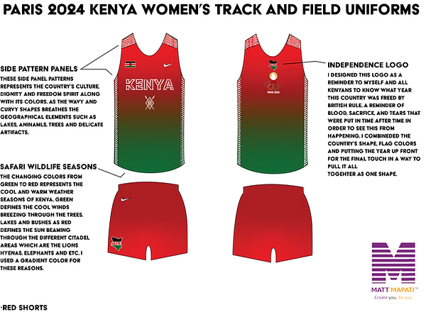
KENYA TRACK AND FIELD 2024 UNIFORM CONCEPT

This project is my most personal because it pays tribute to my roots. Even though I was born in America, Kenya is my second home since my family is from there, since the upcoming 2024 Summer Olympics is approaching, it will be cool to do a mockup for them. For the uniforms, I wanted to create a modern-crisp direction with these and be simplified. Using two unique gradient colors for the Men's and Women's to have a personality of them was key. I feel the women have more expression by combining the red and green, red showing their nurturing heart and green their care and dignity while Men are basic with just red as it demonstrates the pure blood of a true Massai warrior.
DESIGN PROCESS


GALLERY


CINCINNATI BENGALS REBRAND (2026- PRES)

This is a rebrand concept that I came up with over time. I wanted to combine origins and tradition regarding the Bengals uniforms. While paying tribute to football pioneer Paul Brown he was simple and classic when it came to fashion because he wanted to have a team that plays and looks professional every time. By combining the modern and throwback elements, I thought the effort on this was good, however, other areas are in need to be desire.
COLORS

WHITE
PMS
BLACK 6 C
PMS 1655 C
DESIGN PROCESS


GALLERY


MASON CHALLENGER LEAGUE FLYERS (NON-PROFIT PROJECT)

In my last semester at UC, I had the opportunity to do a fun 15-hour service learning project, I redesigned flyers for a non-profit organization called MYO (Mason Youth Organization). The goal was to promote their Little League division The Mason Challenger League, a league of kids with disabilities who need assistance playing the games. Each flyer represents different times, seasons, themes, and attention, I used multiple versions of color palettes, fonts, illustrations, and shapes to achieve this. Overall, the project was a success and the organization's staff was pleased with the final result, it also hit me personally because I used to play for MYO back in grade school, and it helped to realize my love for the game of baseball and make friends along the way as I got older.
BATTER UP!⚾
DESIGN PROCESS


GALLERY

PHILADELPHIA 76ERS REBRAND CONCEPT (2026-PRESENT)

With this project, I involved my favorite basketball team the Philadelphia 76ers to have a complete makeover or in other words a concept rebrand. I wanted to continue the origins of the team's colors, identity, and brand while keeping a consistent modern, and clean appearance. The aim was to form a connection or font similar to America's past culture and fathers such as Benjamin Franklin, Thomas Jefferson, and George Washington because they were the ones who established this great country in 1776 which is how the team got its name. One of the players @tyresemaxey I utilize as a player example to show off the 2D render illustrations of the uniforms.🔴🔵⚪️ #sixers #madeforthis 10 9 8 76ERS!
DESIGN PROCESS


COLORS

PMS 293 C
PMS 877C
PMS 199 C
GOLD


GALLERY


HOPE CHURCH STUDENT MINISTRY BROCHURES
Here is one of my personal favorites, another service learning project I created two brochures for a local Southwestern Ohio church that I’ve attended since preschool called Hope Church back in 2022. They needed me to design a brochure that would make a brand identity for their student ministry of Junior High and High School, as a result, this was a great experience because it taught me how to work with a non-profit organization in person and link myself as a designer and expose my branding skills to the public while giving back to my community.


DESIGN PROCESS

FRONT
&
BACK

FRONT
&
BACK
COLORS

GALLERY


PSA POSTER: SAY NO TO DRUGS

This is a PSA poster I designed from a design class in my senior year at the University of Cincinnati. The goal for this was to expose the rise of deaths that have occurred in the past decade based on drugs alone in the United States, by collecting biased resources or articles supporting the message. I was inspired by the classic propaganda character of Uncle Sam's "Pointing the Finger" ad, which encouraged American citizens to enlist in wars. This led me to design my version, the only difference being that it aims to address a domestic problem that has become an epidemic in today's society.
COLORS

GALLERY


SPOTLESS CLEANING BRAND

I designed a simple business card and letterhead for my aunt and uncle's cleaning business. My goal was to make this design simple, clean and concise so that the viewer can easily look at the logo to see who they are first before seeing the contact information. I only used a one color which is blue because you can create a variety of blues to give out a monochrome look to it. Whether is changing the opacity, hue, tone and saturation in order to achieve the feat, the color represents a line of colors that feels cool, soothing and refresh in which fits the mood for the overall brand.
LOGO

COLORS

GALLERY


SHA'MON! CANDY BAR

My approach with this design is from a personal experience. For me I have a sweet tooth since I was little, Reeses's has been my favorite candy since the beginning and I wanted to combine a half of my love of sweets, musical arts and cartoons into a candy bar. So I came up with the name "Sha'mon!" because I feel that is something that a person would say in the moment without even thinkinga moment of gladness, joyful, excitement or celebration. That's what I want to pitch this project to the kids and young adults, to remind them that there always a delight in life when candy or sweets comes into play.
DESIGN PROCESS

FENGI ENERGY SPORTS DRINK

My most recent and challenging project is a branding pitch for a sports energy drink called "Fengi". I came up with this name because the word is similar to "Feng Shui," which is a spiritual term that originated in ancient China as a system of arranging environments to be in harmony with the natural flow of energy. It's considered one of the main principles of practicing Buddhism. My goal was to create an energy drink that separates the common norm of what people think or see of a sports drink brand like a "Gatorade, Prime, Body Armor etc. And to establish one with a true unique meaning, supporting the overall concept and ingredients of what it stands for which is a drink that takes "electrolytes and energy to the next level with purified natural flavors" instead of a brand with just a cool name with no meaning or background. Hope you guys enjoy!
DESIGN PROCESS

DUMPLIN DIAPER BABY DIAPERS

I came up with this concept based on my personal life. Since I became a first-time uncle my niece inspired me to create a diaper brand for babies titled "Dumplin" which is sort of like a slang term for something cute or adorable. I looked at other brands such as Huggies, Pampers, and Gerber for inspiration. The artwork is inspired by the early books of the Old Testament, especially Genesis, when it comes to creation. Which God created all men, women, and babies in his image including the garden (Eden). As you can see the drawn fruit bushes on the box package. Overall, this was an awesome project to work on and I look forward to designing brand pitches like this!
DESIGN PROCESS


THE IGNINMA DRAGON RESTAURANT

Hey y’all! I recently finished a design project of a concept restaurant (Chinese-theme) named The Igninma Dragon Restaurant. The name originated from the combination of "Ignite" and "enigma." I conducted in-depth research on the legend of Chinese dragons, exploring how they represent power, strength, wisdom, and their incredible power of fire igniting from within. However, me fellow Chinese citizens have never seen them before because it's considered to be ancient, a folk tale, or a mystery. That's where it all becomes an enigma in present times, the projected location for this restaurant is Western California, such as Los Angeles, San Diego, and California, based upon the vibrant colors fitting the overall weather and mood. As a result, creating this concept was really fun and heart warming because I enjoy and respect different cultures, which make me want to travel hopefully more in the future. Plus, I love the food, of course, because I grew up going to a local one real close to where I lived throughout my childhood, hope you guys enjoy it!.
DESIGN PROCESS
LOGO

WORDMARK
SECONDARY LOGO


COLORS

TYPOGRAPHY

THE MAPATI FAMILY FOUNDATION

My most ambitious and personal project to date, this is a non-profit organization based on my last name's kin, Mapati. The name represents "resilience, courage, caring, and heartwarming." These traits came from my mother, who raised two older brothers as a single parent for many years. The intention of establishing this non-profit is to help low-income families, married, single, widowed, or divorced, with assistance such as housing, food, and mental health services, so that they can get out of the tough situations in life. They'll come out the best versions for themselves and most importantly the children, which leads to families becoming closer and whole, referring to the official slogan. The non-profit operates 24/7 and has its main location in Cincinnati, OH. Hopefully can be expanded all over the Midwest region in the United States.

DESIGN PROCESS
LOGO
-12.png)
WORDMARK

SECONDARY LOGOS


COLORS
-18.png)
TYPOGRAPHY

CINCINNATI REDS CITY CONNECT 2.0 (MY VERISON)


The goal for this rebrand is to design key hints, symbols, signs, and traditions that pay tribute to the city of Cincinnati and the history of the first professional baseball team, which has been a principal identity for the city as a whole. By doing so, I look back at the past decades of the Reds’ uniforms, beginning in the 1930s and continuing to the present, when the franchise evolved through various color schemes, including white and red piping, red and black pinstripes, and all-red. From these resources, I utilize modern elements and principles that can be applied to the rebranded City Connect.
DESIGN PROCESS